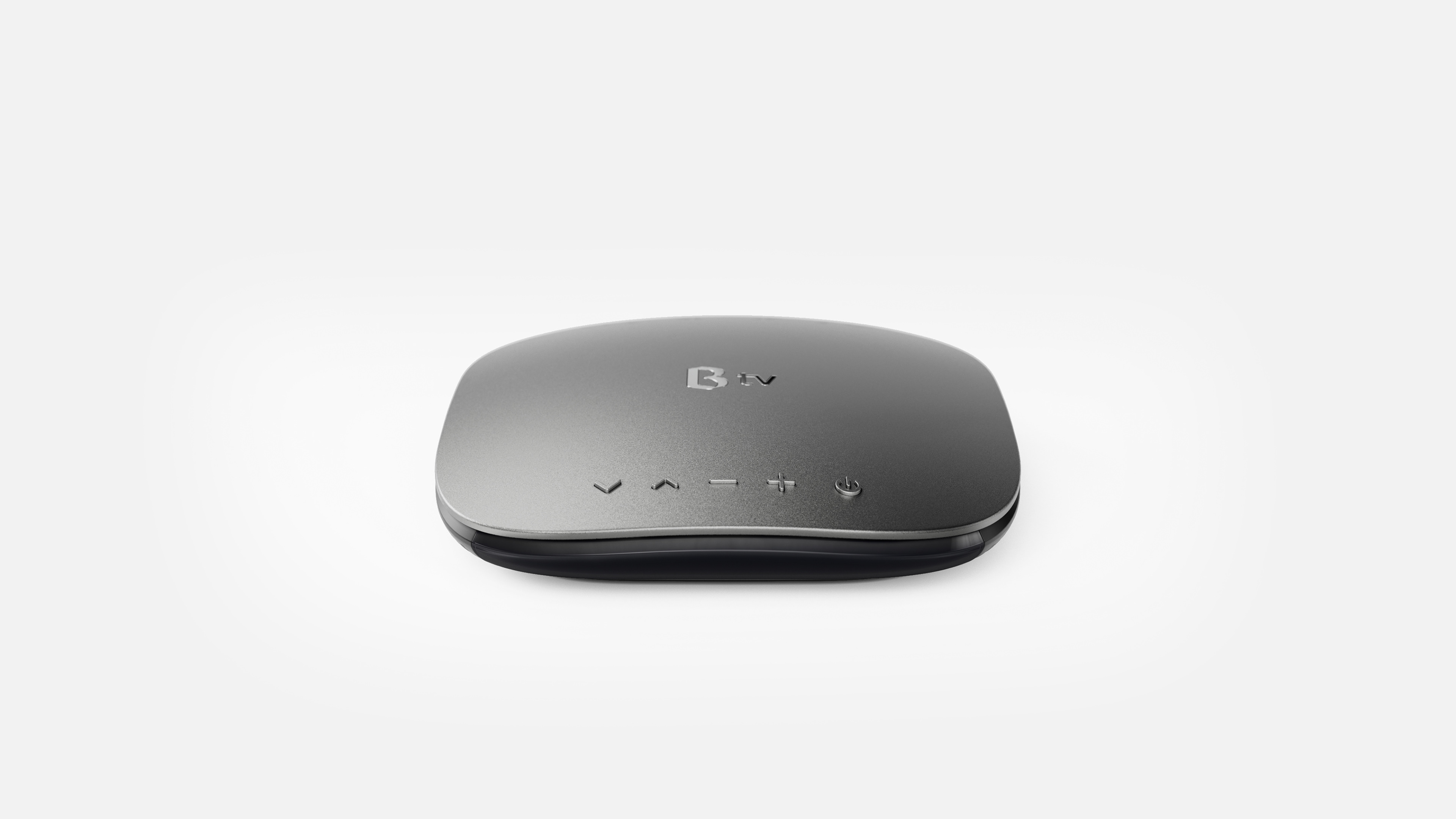
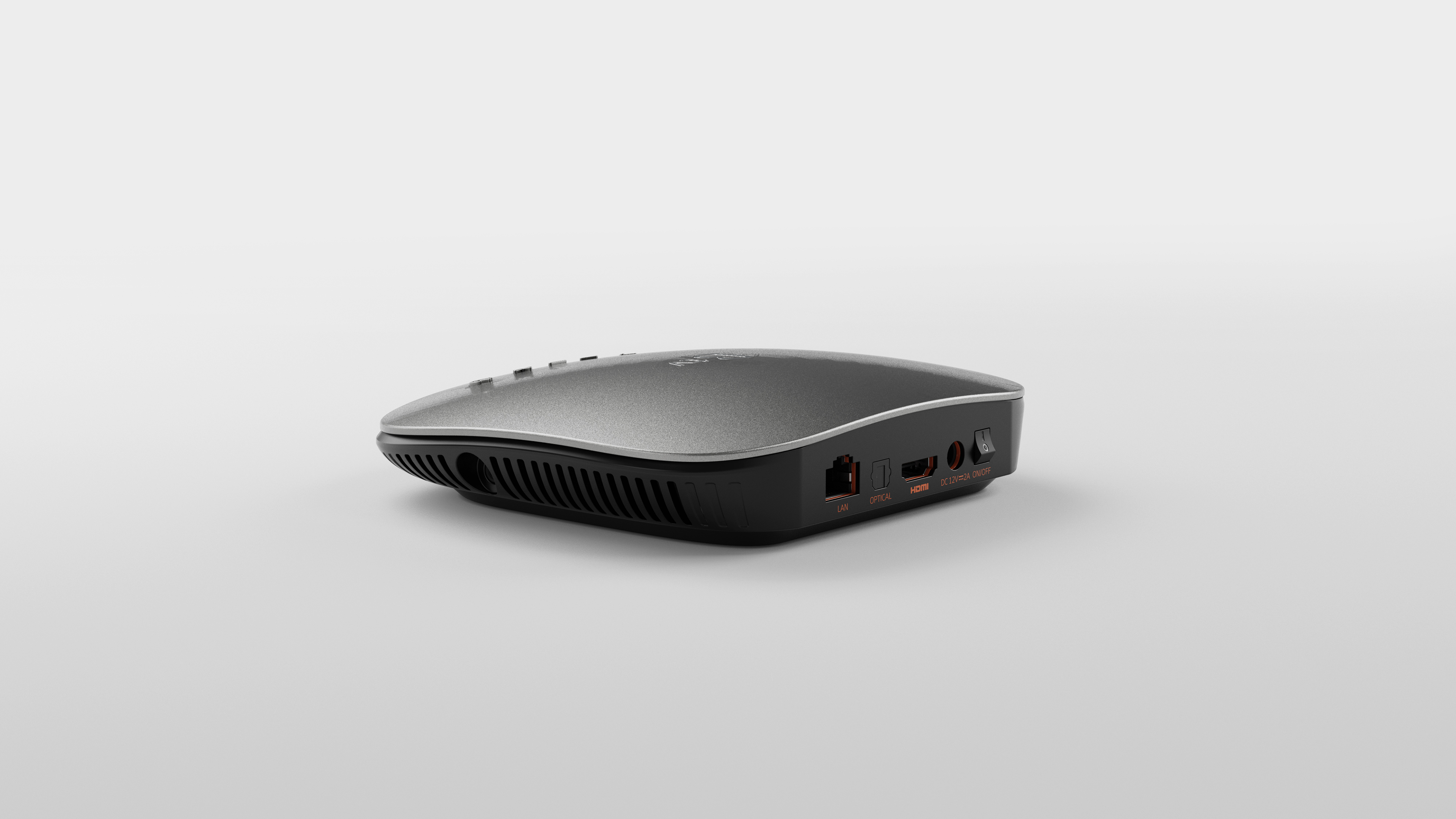
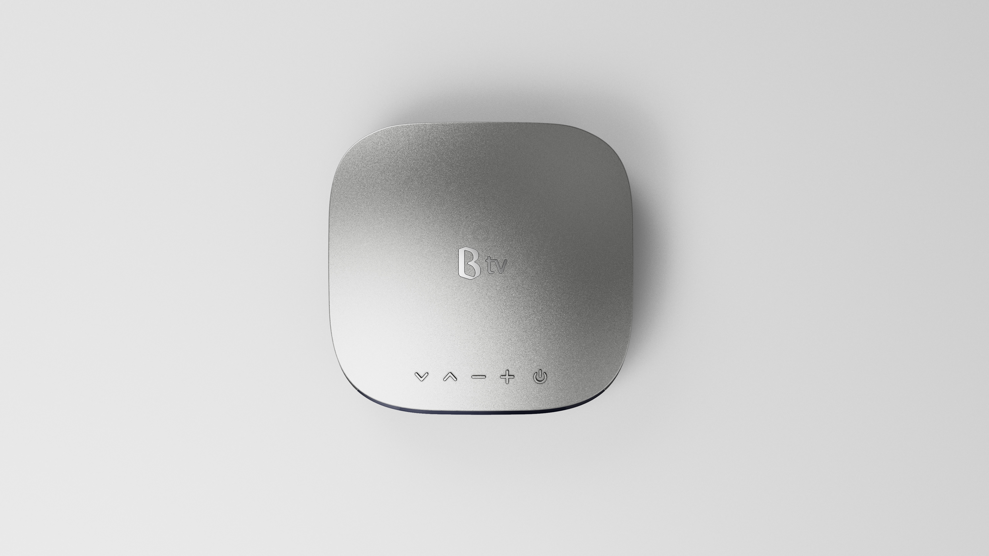
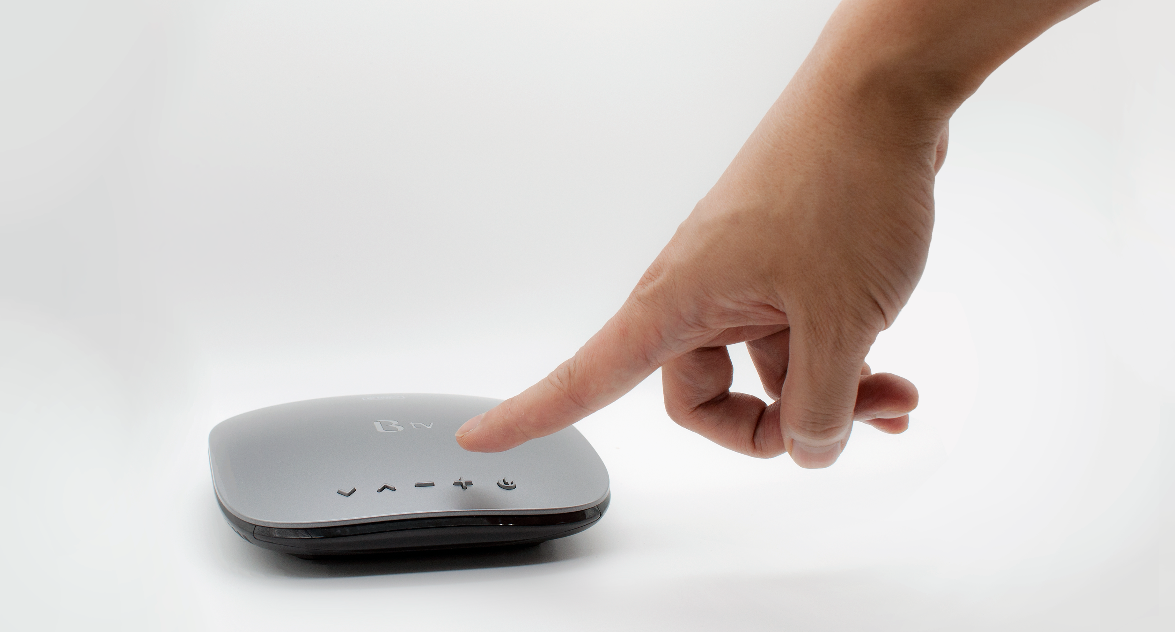
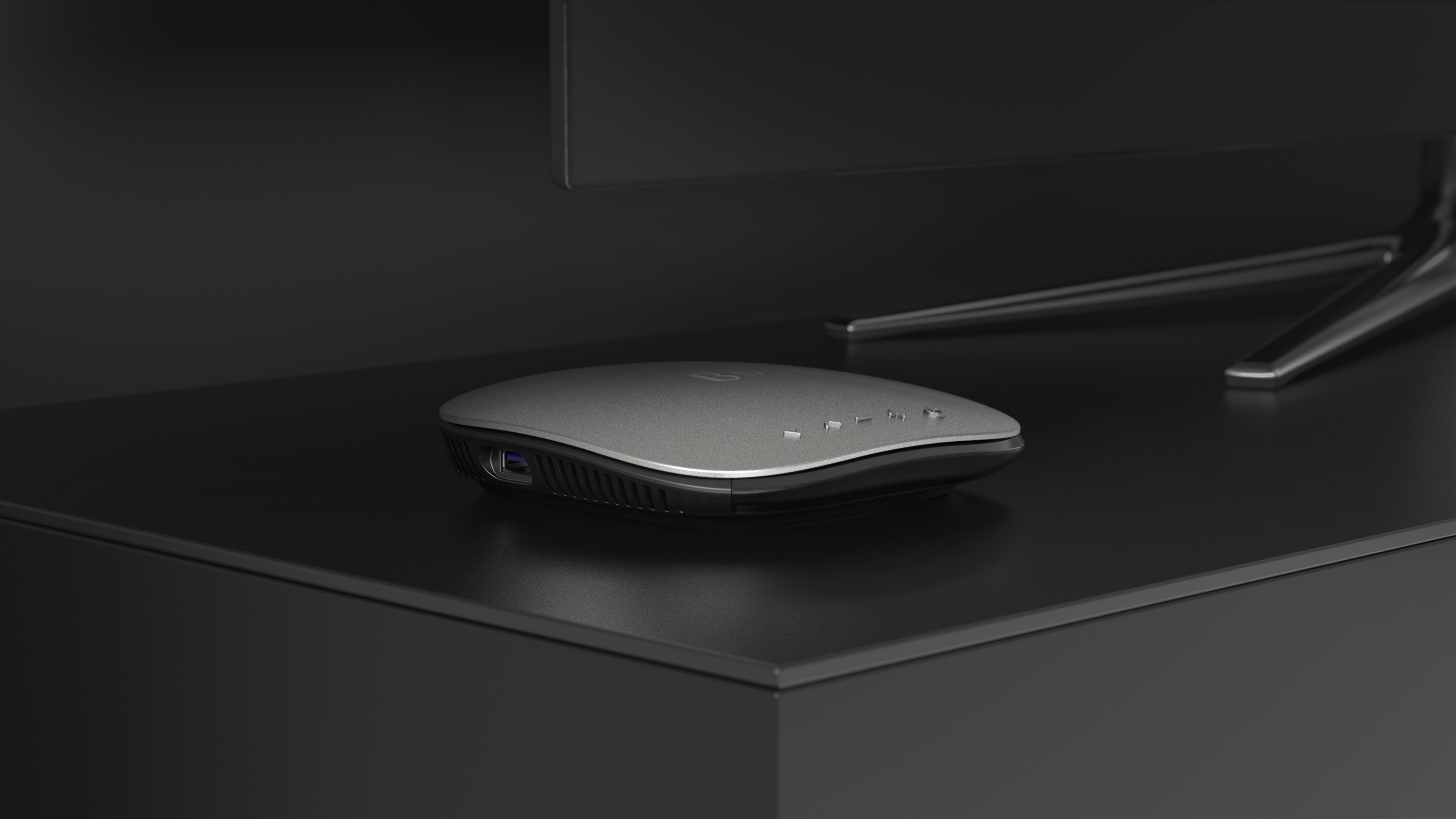
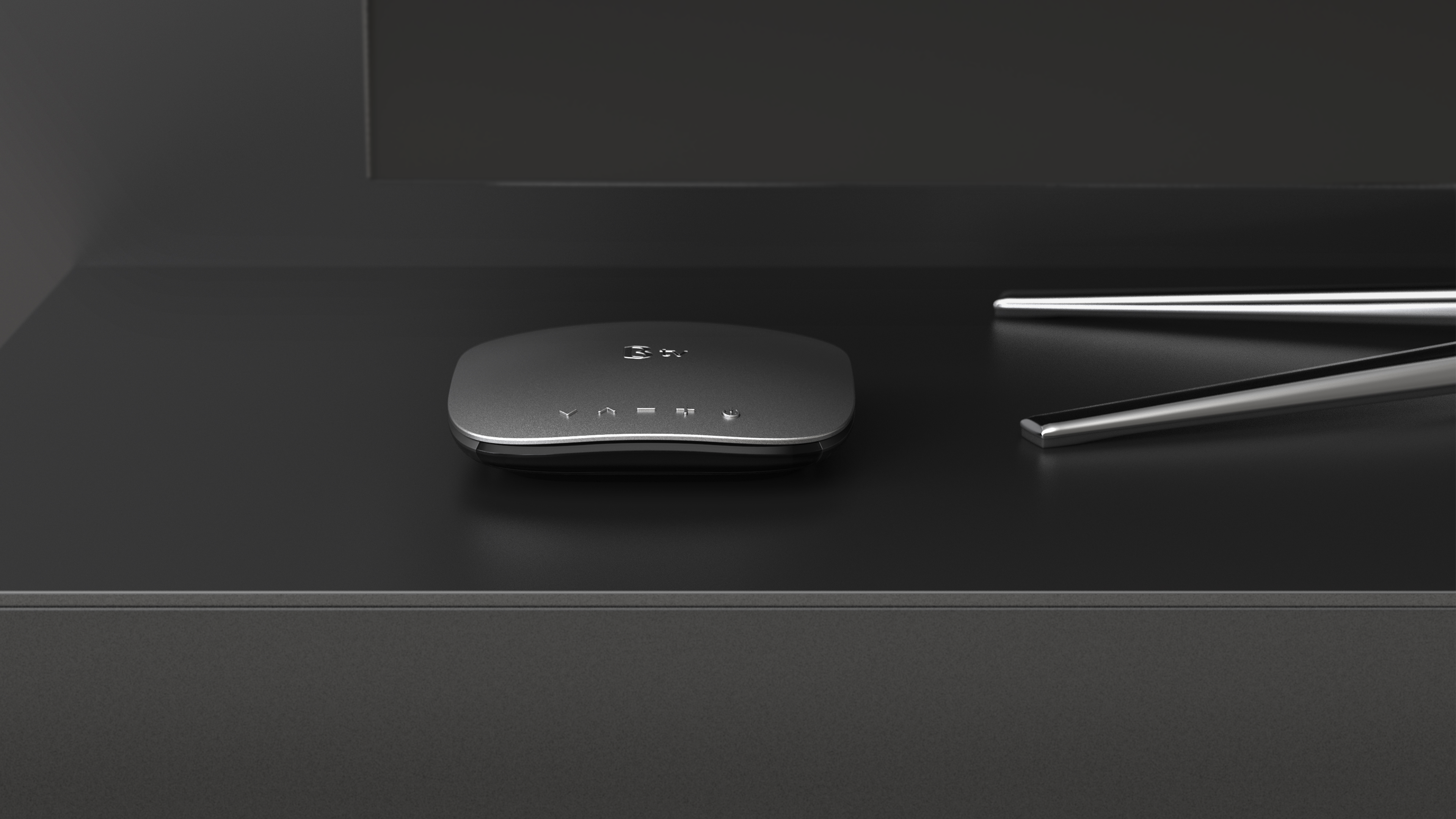
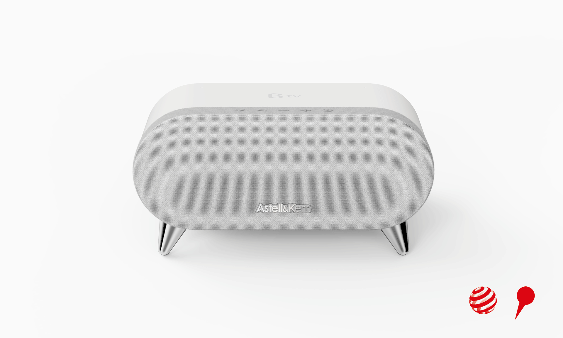
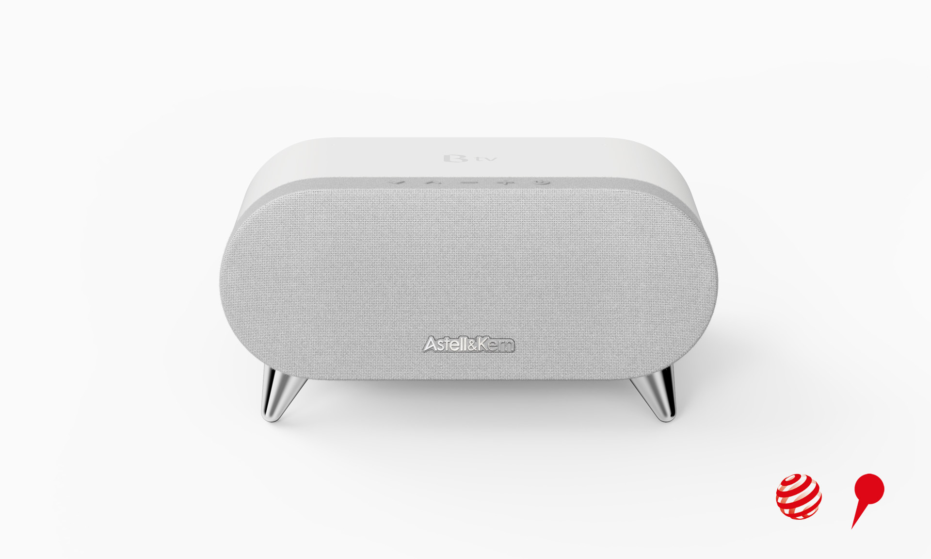
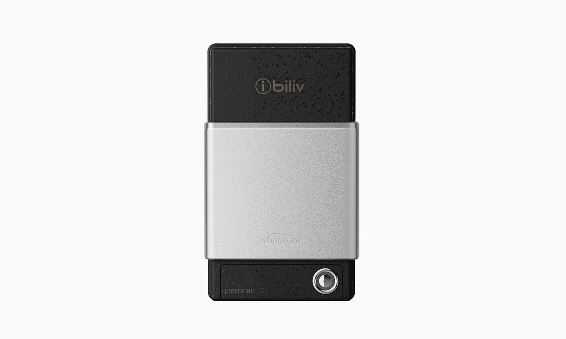
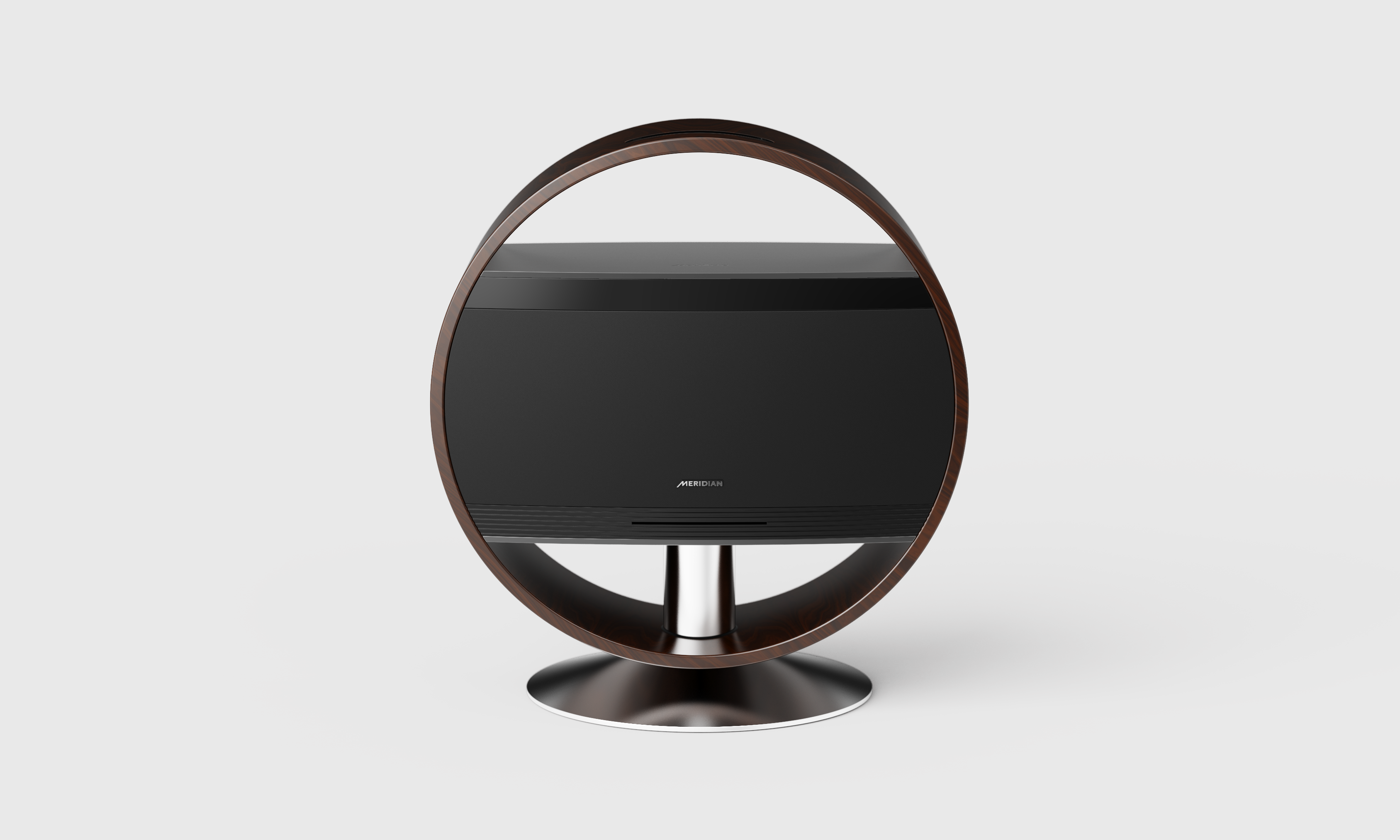
SK브로드밴드의 라운드형 셋탑박스 디자인. 이전의 기계적인 엣지 아이덴티티 디자인에서 탈피하여 섬세하고 샤프한 느낌의 라운드 서피스를 채용 하였다. 부풀어 오른듯 볼륨감 있는 덩어리의 디자인 보다는 리듬감 있고 샤프한 이미지의 라운드 서피스를 탑커버로 하면서 그 테두리 하단에 필요한 디테일들을 배치 하여 숨겼다. 버튼은 SK브로드밴드의 아이덴티티에 따라 아이콘 형태의 버튼으로 표현 되었고 상단 중앙에 Btv 브랜드로고를 크롬으로 배치하여 브랜드 각인 효과를 주고자 하였다.
SK Broadband's round set-top box design. Breaking away from the previous mechanical feel edge identity design, a round surface with a delicate and sharp feeling was adopted. Rather than designing a voluminous mass as if inflated, the round surface with a rhythmic and sharp image was used as the top cover, and necessary details were placed and hidden under the border. The button was expressed as an icon-shaped button according to the identity of SK Broadband, and the Btv brand logo was placed in the top center in chrome to give a brand engraving effect.